A bold identity for new interior design studio, Colour Brave Interiors
Colour Brave Interiors exists for those who want to live a more colourful life; one full of fearless adventure, wonder and excitement. Founded by Michelle Eaves, this new interiors studio is here to shake things up a bit, rid your house of those insipid beige colour schemes and breathe a little soul back into your home.
What we did: Brand Identity, Graphic Design

Colour has the power to relax, excite, soothe and seduce. From glorious greens, rosy reds and plush purples to mellow yellows, vivid violets and brilliant blues, there’s a hue for everyone. Colour Brave Interiors transform houses into vibrant and functional homes for clients who want to be bold with colour and have their personality reflected throughout their interiors.
With only a pre-designed logo in their brand toolkit, Colour Brave Interiors approached Studio Resolve to expand their visual brand out into a fully functional brand identity.
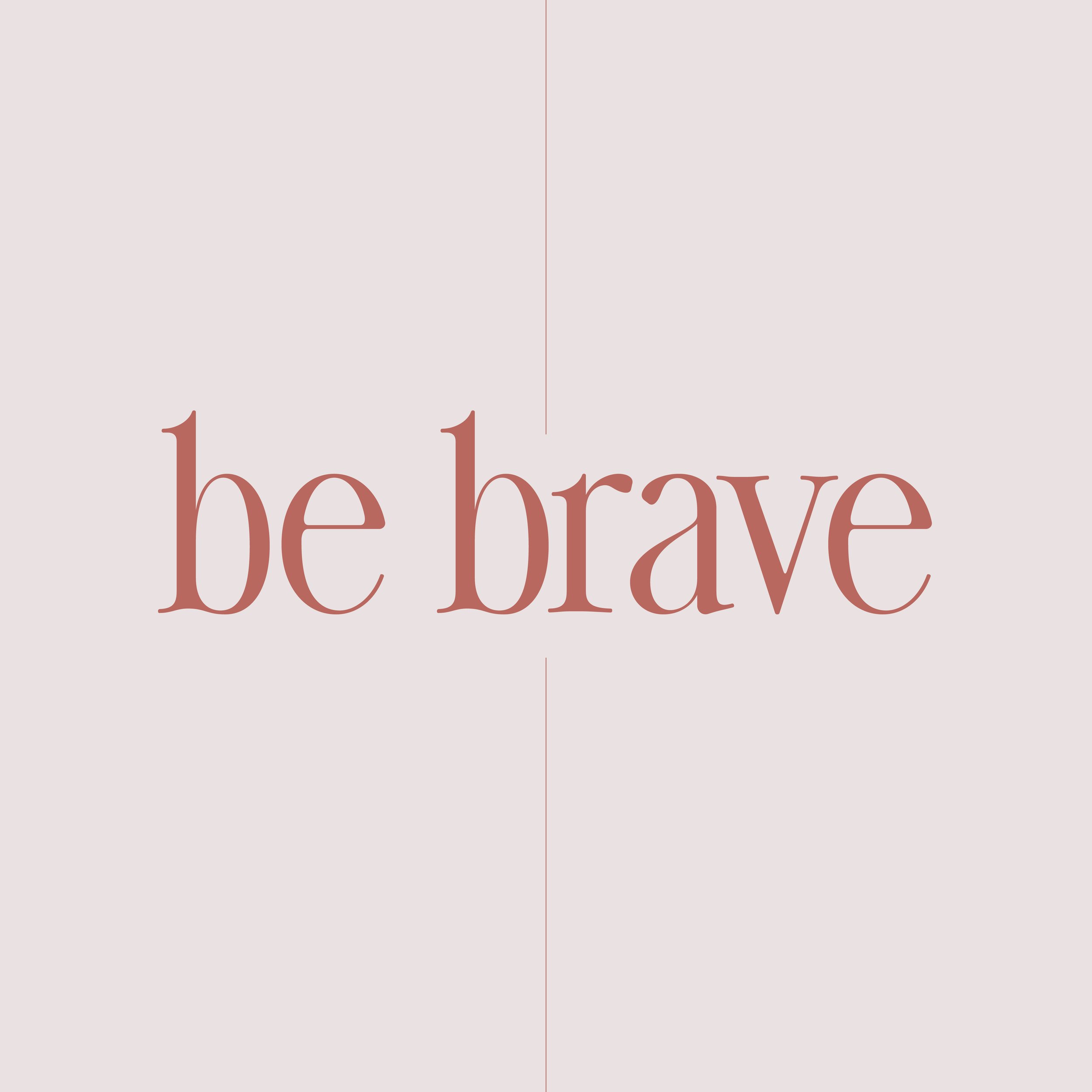
With a name like ‘Colour Brave Interiors’ we knew that two themes were going to be crucial in communicating what this fledgling interior design studio was all about. Firstly, there needed to be a clear focus on ‘colour’ and a defiant willingness to use it consistently in the brand. Secondly, a focus on the ‘brave’ aspect of the company name meant we needed to use colour confidently, ‘show off’ with bold colour pairings, adopt a ‘go large or go home’ attitude when it came to typography and be experimental, yet sophisticated, in the layout styles.
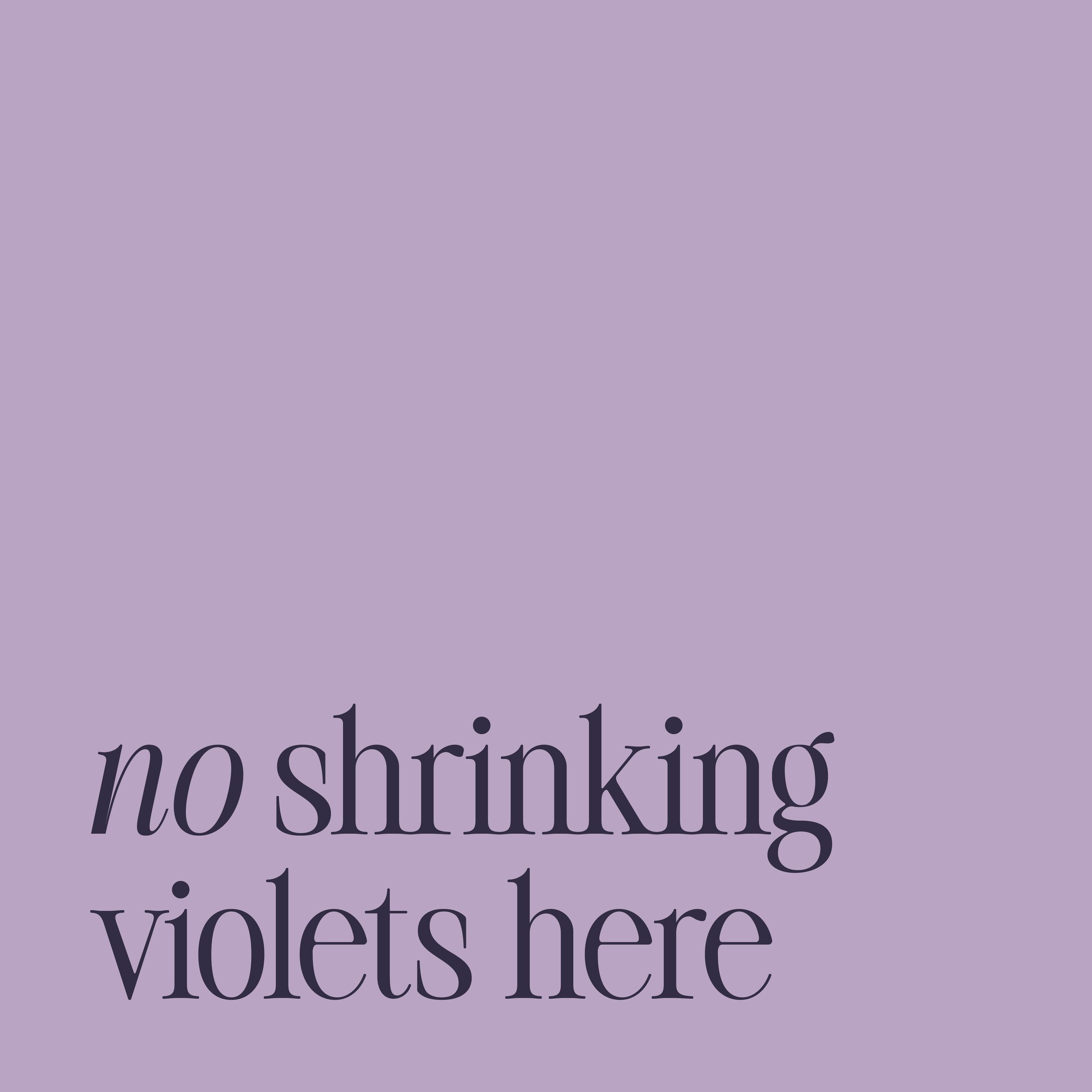
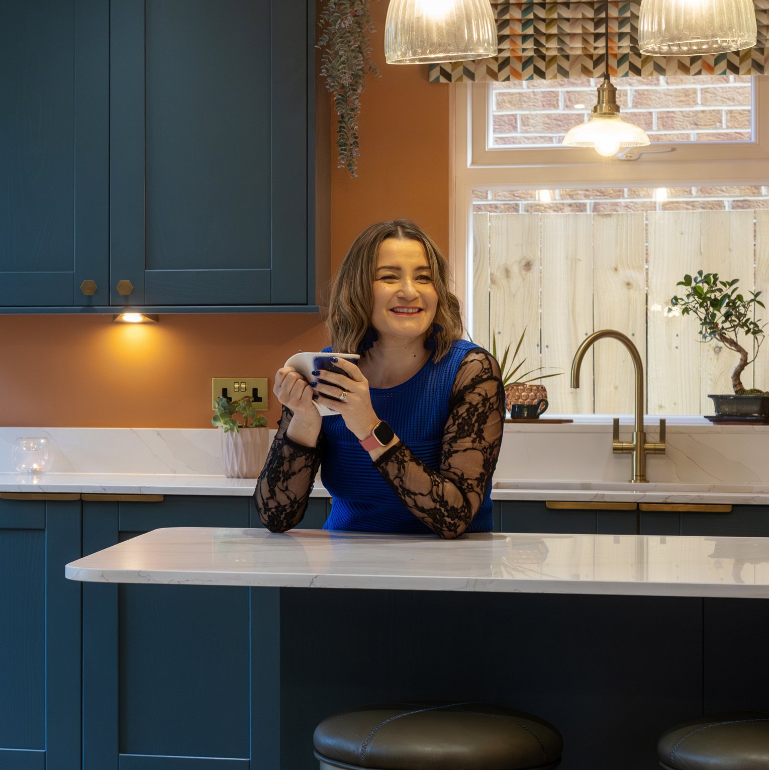
Michelle is a passionate advocate of style, a fearless supporter of our senses and confidant of colour; Colour Brave Interiors isn’t for shrinking violets.
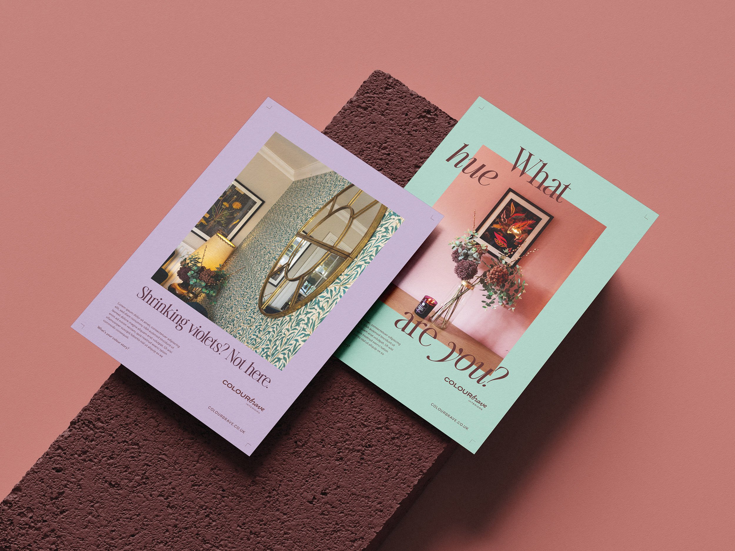
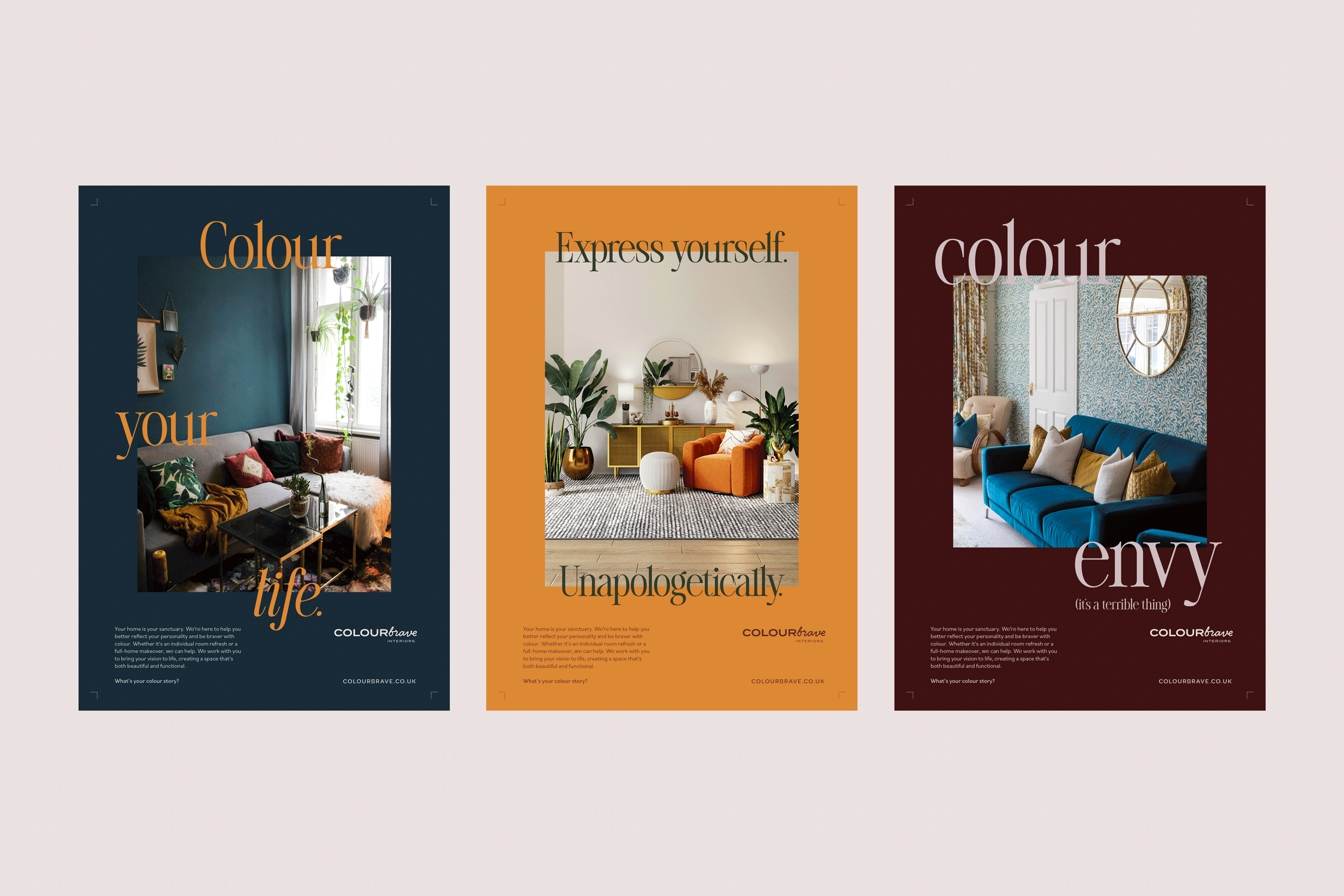
Interiors photography by Focal Point Photography mixed with some purchased stock imagery. Logo design by Lauren Woods.
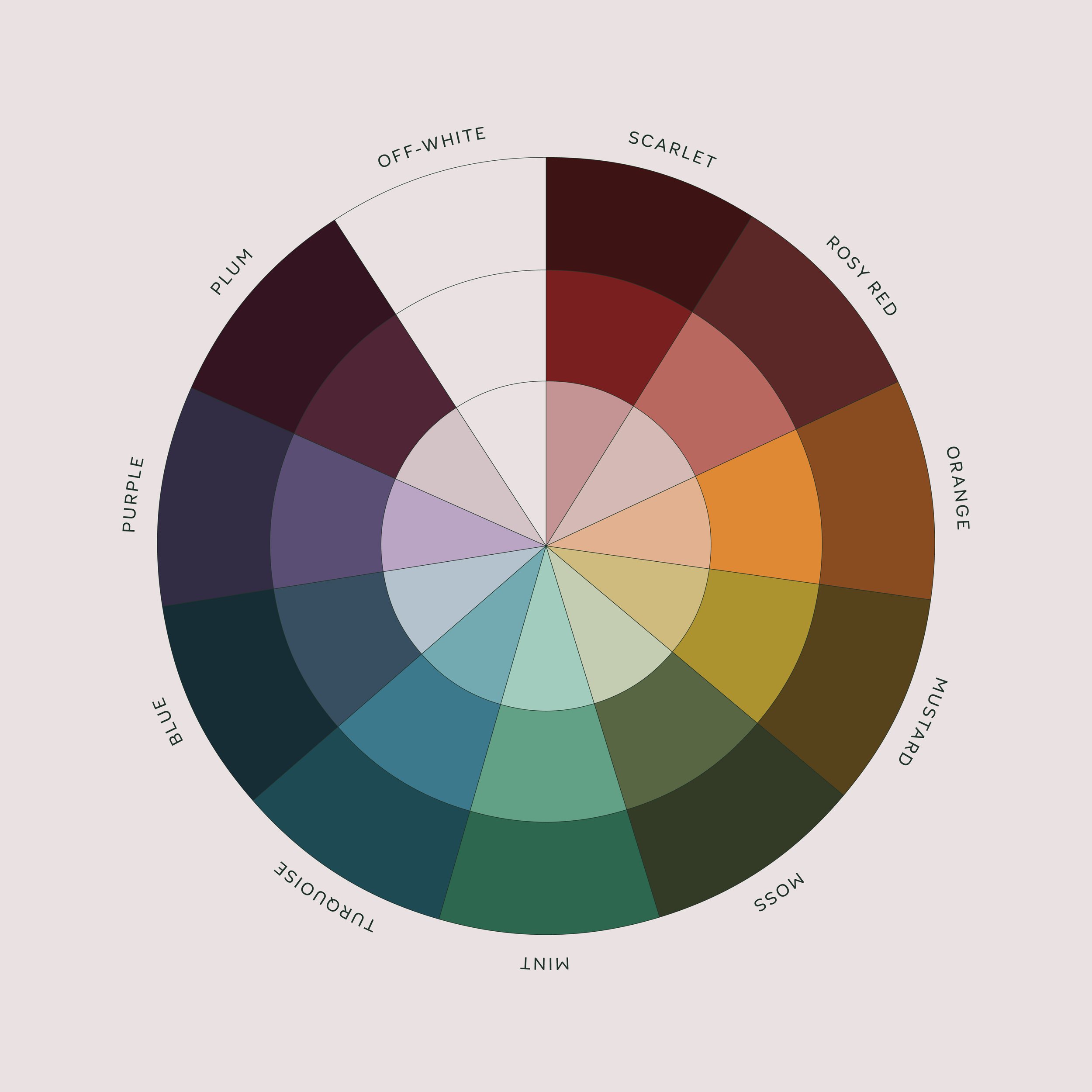
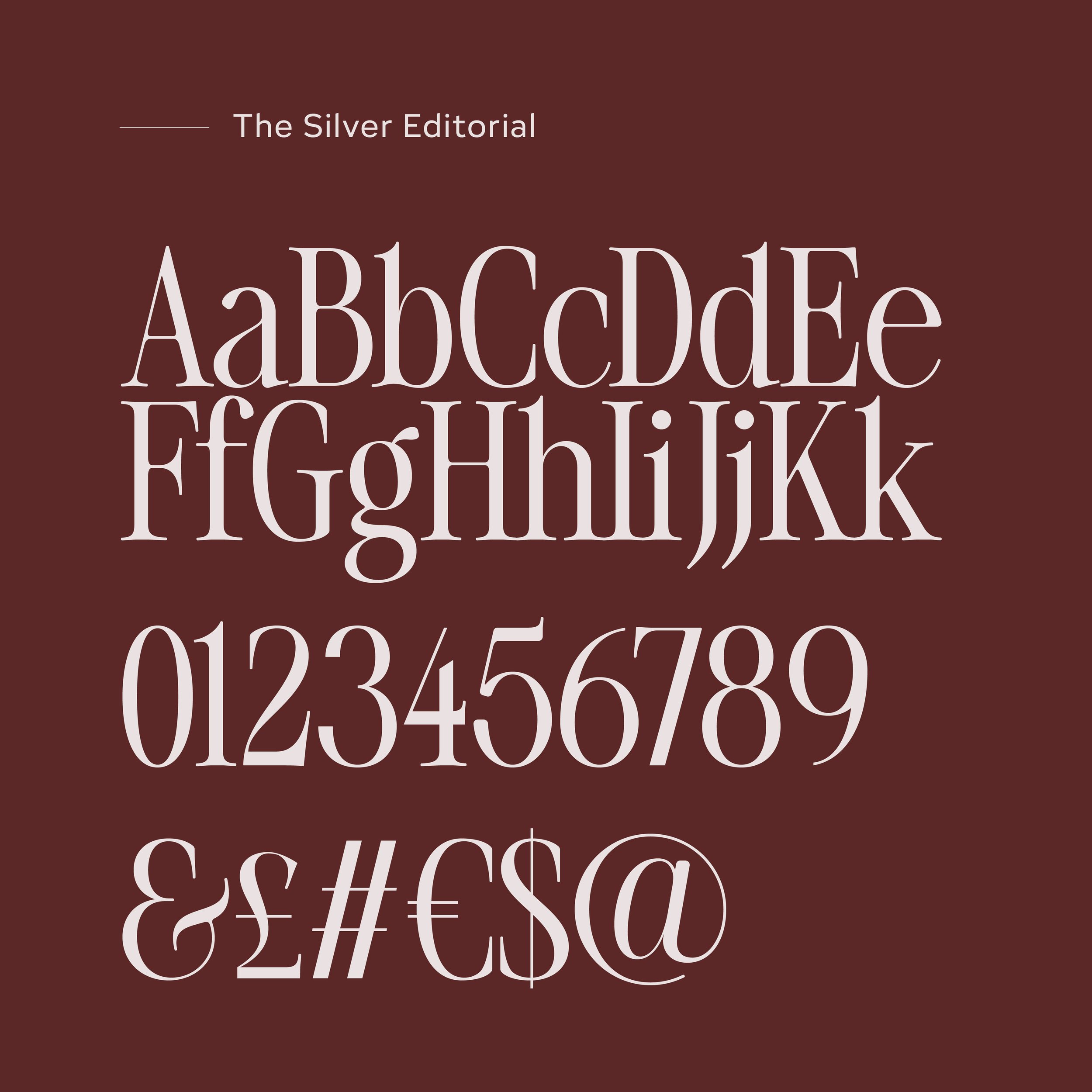
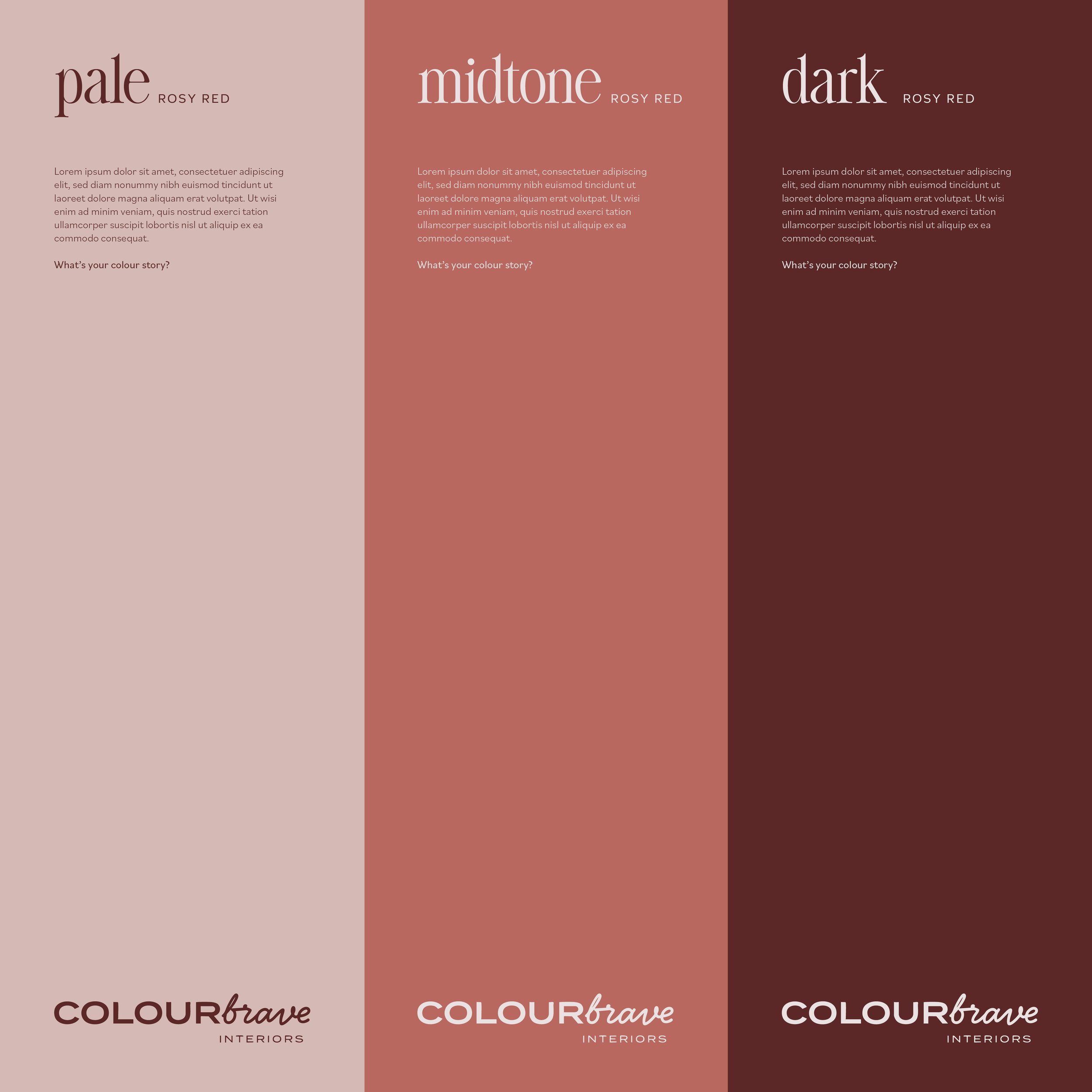
We built the brand up, carefully considering everything from type, colour and layout style. We chose an elegant, serif typeface and paired it with a simple sans serif for a harmonious and fresh look, whilst expanding the brand palette out to include a pale, midtone and dark version of each brand colour.
It was crucially important, with this project in particular, that we didn’t create a brand that was louder than the interior design work itself. The photography of the interior spaces created by Michelle need to be allowed to sing, so the brand system created was devised to be able to work in harmony with any style of interiors. The huge palette of over 30 colours also means that there is a vast array of unique colour combinations that can be used in this bold, colourful brand identity.

“A perfect creative partnership. From start to finish, Beccy listened and understood what I wanted to achieve. She delivered everything I wanted for my brand and more. The brand identity is brimming with personality and colour, just like my interiors.
Beccy is super passionate and hugely talented, a perfectionist and goes above and beyond. We worked collaboratively and she asks all the right questions so you get the best creative output.
Thank you Beccy. You have been super supportive, a dream creative partner and we will definitely work together again - a perfect collaborative combination. ✨”


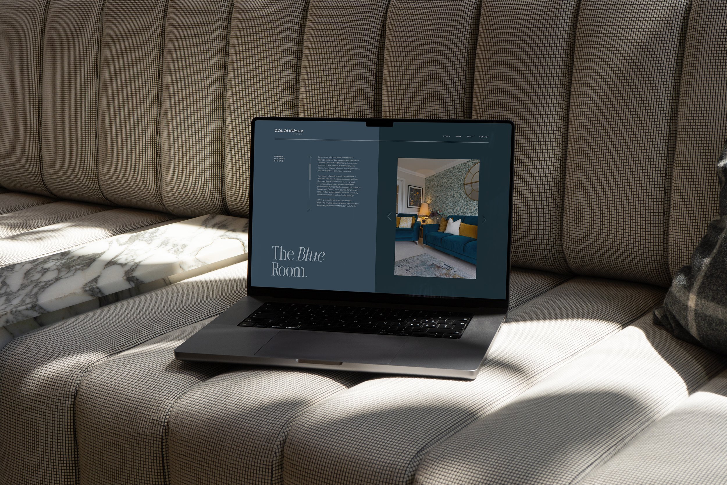
The website was built by web developer, Tom Kidd.

If you think your next project could do with an injection of creativity from a studio with heart and soul, we’d love to get involved.
