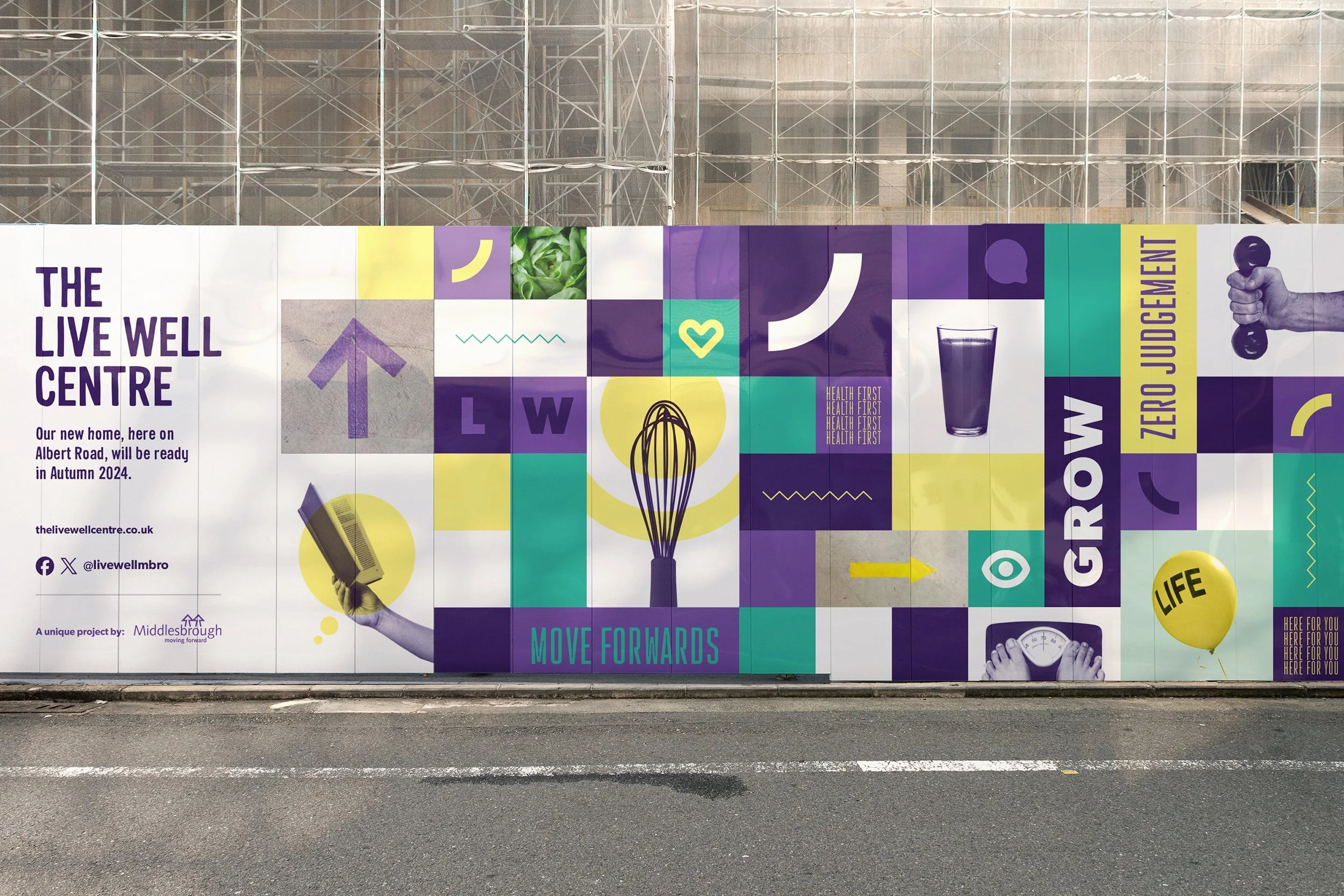
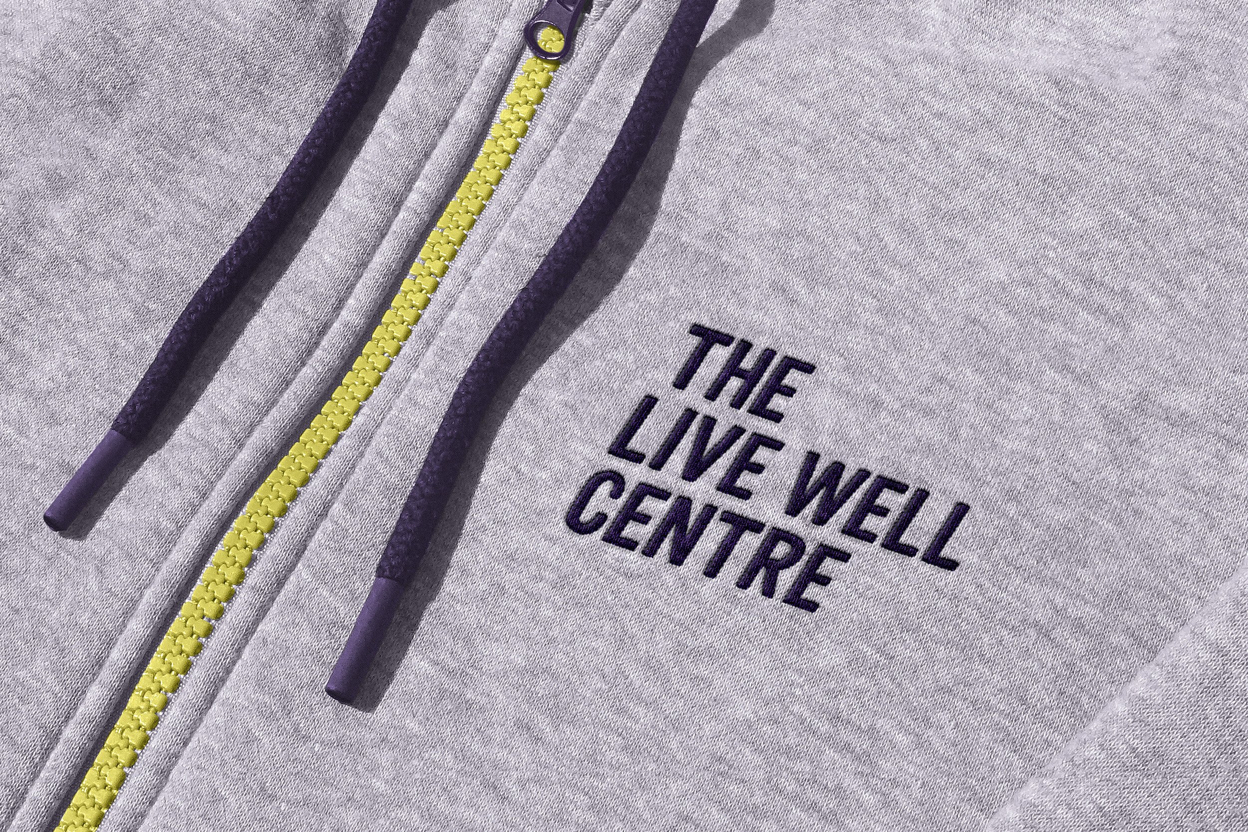
British Cycling’s elite East Cleveland Classic

British Cycling’s ‘National Cycling Championships’ is the biggest event on the UK’s road racing calendar and in 2023 Redcar & Cleveland played host for the very first time. We were asked to design the logo for a new legacy race, the East Cleveland Classic, which aims to keep cycling alive in the area, for generations to come.


What we did: Creative direction / LOGO DESIGN

British Cycling are the national governing body for cycling in Britain. They exist as leaders in the field of cycling but also as supporters, helping communities discover the joys of this exhilarating sport.

The new legacy race, the East Cleveland Classic, builds on the success of British Cycling’s ‘National Cycling Championships’ which drew in hundreds of spectators from across the country.

Our brief was to create a dynamic logo for the race that helped communicate this was an elite race, a technical course and a serious challenge for the athletes competing.


“British Cycling found Studio Resolve to be a friendly, creative and professional partner in creating a logo for our new, dynamic road race, the East Cleveland Classic. It was important to us that the design represented the high standards associated with our brand and we weren't disappointed. We would highly recommend tapping into their creativity for your next design project!”

— Jonathan Day, Managing Director (interim), British Cycling Events


The race starts and finishes in Saltburn and goes through the local towns of Skelton, Guisborough, Margrove Park, Boosbeck, Lingdale and Brotton. The concept for the logo was inspired by the shape created by this route, when viewed from a bird’s eye angle, creating a totally bespoke shape, unique to this race only.

We simplified the shape using just ‘circular corners’ and ‘circular bends’, as a nod towards the gears found in the mechanics of the bike but also the shape of bike wheels. As the route is also very undulating, taking riders across challenging countryside sections (as well as the infamously winding Saltburn Bank) it made sense to try and reflect this in the design of the logo.

The result feels really dynamic, encapsulating what this race is all about; undulating, technical and challenging.


“I love the complexity of this logo design. This bike race is for elite athletes and the logo needed to communicate this. I believe in the power of staying active, moving your body and spending time outdoors, so was delighted to devise this logo for this new event.”

— Beccy, Founder of Studio Resolve


If you think your next project could do with an injection of creativity from a studio with heart and soul, we’d love to get involved.